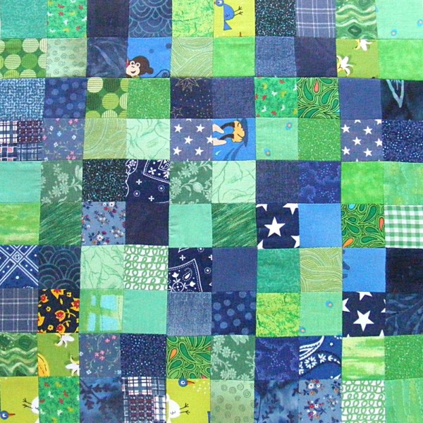
 Here’s block #3 in the scrappy quilt-along.
I love it!
This time I went for a classic checkerboard in pretty blues and greens.
My inspiration?
A block sent in by a reader!
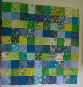
Ann shared her first block and wrote. . .
Blue and green stripes – not as noticeably ‘stripy’ as I had hoped for – will try for greater contrast in next block.
Here’s Ann’s block.

I have to say right here that I love this block! So much that it inspired the color combo in my own block #3.
But I see what’s Ann’s talking about so I’m going to share a little color lesson here.
The Official Quilters Rule (which you may choose to ignore at any time) is to choose your lights and darks carefully.
Ann has her rows divided by color, but within each stripe there’s a full range from very light to medium dark.
Sometimes your eye wants to see contrast because of color, and sometimes it wants to see contrast because of shade.
The best example in this block is that stack of three very light colored blocks right in the middle of the bottom three rows. See how your eye wants to group them together as one tall rectangle? That’s because they’re very similar in shade, even if some are blue and one is green. And they’re surrounded by noticeably darker blocks of both colors. That breaks up the desired stripey effect by creating a competing shape that the eye likes more.
I happen to LOVE this dapply effect and I reproduced it in my own block. But if it’s not your cup of tea, here are a couple of things you can do to help bring up the contrast.
1. Be more mindful of your darks and lights. If it’s hard for you to “see” the effect you’re getting, try using your camera to help. Lay out the blocks you think you want to use, snap a photo, then convert the image to black and white.
Here’s Ann’s block converted.
Without the distraction of color you can more easily see that it’s a random assortment of light and dark.
Use this tool to help you really see which blocks are lightest and which are darkest. If Ann had used only her darkest blues and only her lightest greens, she would have gotten the more stripey effect she wanted.
You can get the same help by looking through a red lens – faster than taking photos and fiddling with filters. Quilt shops used to carry them, but I haven’t seen them in a long time. Get some red acetate from a florist and look through it to make a cheap and easy red lens for yourself.
2. Use the distraction of color to your advantage. If I’m pairing two colors in a block I almost always go for a warm color and a cool color. That helps your eye see contrast between the colors where there’s very little (or no) contrast in the shade. Take a look at my first block.

If you look at the grayscale version it’s very clear that this is a big wash of medium tones with almost no contrast except a handful of randomly-placed very dark squares. (A total failure according to Official Quilter Rules.)
But in color you can clearly see the stripes! Thank you warm and cool contrast! 🙂
The reason Ann’s block didn’t feel stripey enough to her was because it had a range of shades in both color stripes and blue and green are right next to each other on the color wheel.
Again – I love it! But now you have some tools to help you out if you feel like you’re not getting the contrast you want. Thanks, Ann, for letting me use your block as an example! And for inspiring my third block. 🙂
Ready to make your own Block #3?
What You’ll Need
- 52 two-inch squares in color A (shown in green)
- 48 two-inch squares in color B (shown in blue)
Instructions
Use 1/4″ seam allowances for all sewing.
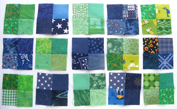
Arrange your squares according to the exploded view.

Sew sets of four blocks into squares. Then arrange those squares in rows.

Doing it this way will keep the edges of the color blocks perfectly straight, even if your seams and intersections aren’t perfect.
Sew the larger blocks together into rows.
Press all the seams. I’m pressing mine open for this quilt. I think it will make things simpler in the end.
Sew the rows together to make the finished block.
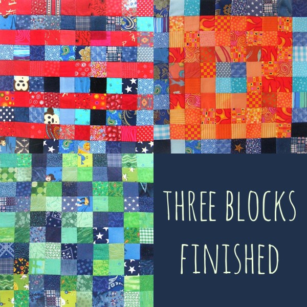
Here’s what my quilt is looking like so far.

I love it! But I have to NOT use blue in the next block. 🙂 I didn’t realize until I had put them all together that every block has blue so far!
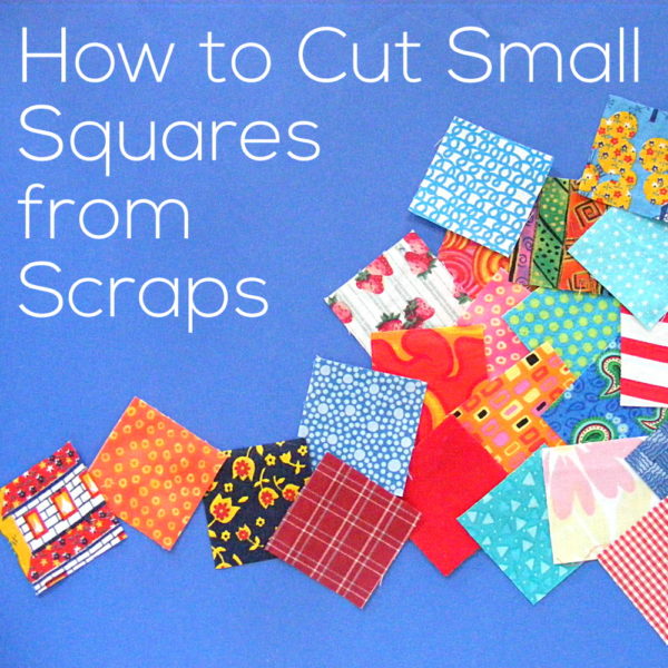
Block #4 coming next week! And take a look at this video showing how I cut my squares from scraps.
Click here for all the Controlled Chaos posts.
If you’re stitching along – please share photos of any finished blocks in the Shiny Happy People group! We’d all love to see what you’re making!
Happy piecing!
Best,
Wendi




 Here’s block #3 in the scrappy quilt-along.